statement of intent
I aim to produce a website of work demonstrating my ideas, development, creative work and reflection based around the theme of the ‘objects.’ At the end of my coursework time, I will choose my best Photographs and present them in a final gallery.
For my initial research I will start by looking into photographers who take images of ‘object’. At the moment, I have three in mind that I want to look at. These are Edward Weston, Camilla Catrambone and Jim Golden I chose Jim Golden because he’s a contemporary photographer that documents bright objects and I think that I can gain a lot of inspiration from his work for my own work. I really like the set up of his beautiful objects that are documented. I chose to look at Camilla Catrambone as her work focuses on different types of objects in one picture and I feel that her work matches mine a lot it also brings out the orgonization of the photos it matches what I aim to photograph and produce but also looks professional and striking. It would be a good contrast to the other photographers as the objects she photographs have a personal meaning to her this will help me decide in which direction I want my work to go in.
When I chose this theme, my initial thoughts were of objects relating to a person groups of objects for example gardening objects, groups of the same item in the same photograph like tea cups. The project title actually allows me to look at so many more routes in which my work can down such as grouping objects together by colour and creating a composition through them that looks interesting. I could do studio shots as well as going outside on location. If I get a range of different objects, this will allow me to have more images to experiment with and contrast, once refining my work in Photoshop.
I will begin to start taking photographs of glass ware, tools, tea cups and frames. I will then develop these images further by taking more ideas from them and editing them in Photoshop. I then hope to use colour more in the grouping of objects that I am going to collect and create something using the influence of Jim Golden. I already have a lot of ideas running through my head for this project which will help me in the right direction of taking images of objects that I can use for my project.
I am going to use a canon camera and also my mobile phone. I will need a studio setup which will include the right background for my object, for example insuring I have natural wood effect of a table when taking images relating to gardening tools and a plain backdrop. I am going to use a birds eye view to capture my images, I may also need a tripod to allow me to take accurate images of the composition of the objects that I create.
I have 3 months to produce a page on my Website displaying my work showing my journey towards my final piece. I will create a timeline which will allow me to have control over how I am going to complete my project. I will aim to complete my initial research within the first few weeks and start photographing by the 3rd week this will allow me enough time to show the progress of my ideas. I will then continue to develop my work In photo shop and be prepared to refine my work as I go. I would hope to capture new images to enhance my project. When I have completed this project, I will select my best photography outcomes and display them in my final gallery.
As my project progresses I will use best and worst images to help me decide how I will improve my next shoot. I will use annotations to display my development clearly. By using annotation I feel helps me reflect on the work I produce. I will mainly seek advice from my teaches and my classmates on how to make my work better, as I’m always wanting to achieve the best possible outcome. I will also watch tutorials and demonstrations and find my own as well to help me develop my skills and knowledge of Photoshop. After finishing my final gallery I will write a final evaluation on the project as a whole, reflecting on what went well and what I would do differently or change given the time.
4'CS

context
I have found this photograph on the internet but I do not have the name of the photographer who took the image.
Below is the link to the internet page where I found the image.
https://www.google.com/search?q=photographers+who+use+colour+objects&tbm=isch&ved=2ahUKEwjXhbXNw879AhVaQaQEHfspCdAQ2-cCegQIABAA&oq=photographers+who+use+colour+objects&gs_lcp=CgNpbWcQAzoFCAAQgAQ6BggAEAcQHjoHCAAQgAQQGDoECAAQHjoGCAAQBRAeUO8EWM4pYJYtaABwAHgAgAFciAH_BJIBATmYAQCgAQGqAQtnd3Mtd2l6LWltZ8ABAQ&sclient=img&ei=B6YJZJfmM9qCkdUP-9OkgA0&bih=789&biw=1600&rlz=1C1GCEB_enGB1047GB1047&safe=active&ssui=on#imgrc=dPvDc3JKlzZT9M....
COMPOSITION
The main composition of this image is the bottles lined up and in a straight row that cuts across the middle of the photograph. The photographer does not use the Rule of Thirds, but there is symmetry in the way the bottles are positioned. A good contrast is created by the stronger colours of the bottles against the pale pink background. However the green and purple bottles pop out to me a bit more than the other colours. In my opinion I think that the photographer has taken this shot in a studio, with the camera on a tripod and has used an infinity curve so we do not see any marks or edges in the background. The camera is slightly looking down on the set-up so that we can see the tops of the bottles and the flowers in them. The flowers are softer forms than the bottles which draws your eye to them. The lighting is quite flat, I cannot see many shadows and so I think the lighting may have been overhead. The setting uses a shallow depth of field and I think the Fstop may have been around F11, ISO 100 and the exposure set in the middle.
comment
I enjoy viewing this image and I believe that it has many strengths, the main aspect of this image that I am very fond of is how the colour of the objects are portrayed through the image. It has been captured so clearly that I can almost feel the textures.
connection
I think that this image connects to my work a lot because of the colour pallet. In my own work I would like to make my images to look like this.

comment
In my opinion I love the way this image has been taken because the two colours go together so well and also the detail the photographer has made the camera catch is what I would like to do in my own work. I also like this image because it portrays how different colours can match and the texture in this photograph makes it look better and I hope to create similar images in my own work in the future.
context
I have found this photograph on the internet but I do not have the name of the photographer who took the image.
Below is the link to the internet page where I found the image.
https://www.google.com/search?q=coloured+objects+photography+fruit+blue&tbm=isch&ved=2ahUKEwiZuNW3qNH9AhUksEwKHfx9C90Q2-cCegQIABAA&oq=coloured+objects+photography+fruit+blue&gs_lcp=CgNpbWcQA1DQBlifJmD2KWgAcAB4AIABZ4gBiweSAQQxMS4xmAEAoAEBqgELZ3dzLXdpei1pbWfAAQE&sclient=img&ei=MRwLZNnbKqTgsgL8-63oDQ&bih=789&biw=1600&rlz=1C1GCEB_enGB1047GB1047&safe=active&ssui=on#imgrc=0sCB46bQSVe9pM
COMPOSITION
This image has been taken from a normal view so that we are looking at eye level to the painted fruit, so that we engage with the subject matter. The main focus of the photograph is the contrasting and odd colours of the background and skin of the fruit which is blue, against the yellow of the fruit's flesh. The colours go well together in this image because they are bright and vibrant. The backdrop makes the photograph look smooth as he has used an infinity curve so that we only concentrate on the main object, which is in the very center of the image, the rule of thirds has not been used. Because of the contrast in colour, we focus on the inside of the fruit where the professional shows the detail of the object inside and the contrasting texture. In my opinion I think that this image is taken in a studio, with the camera on a tripod and the lights above on the left hand side as we can see a slight shadow. The outside shape of the fruit is a strong round shape but there are no other leading lines.
CONNECTION
It links directly to my work as I plan to create similar outcomes as the photographer has, which is capturing a image with bright objects included in the image. The photographer has executed this very well, as the image conveys the essence of the orange and the 2 different color combinations in the image, without jeopardizing any element. I also intend to focus on the beauty of bright color pallets throughout my work and this image has definitely inspired me to take images in such a way that all components of the image need attention, not just the subject.
research- edward weston

comment
In my opinion I really like this image because It relates to my work, making an object seem special and unique. I also like the idea of using black & white to give a different feel to an object but I think I might keep mine in colour. What I do like is the way the photographer has zoomed in to the object, cropping it tightly so we really look at it.
composition
This image is a studio shot that has been carefully lit with natural light, with hard shadows to bring out the texture and form of the shell shape. The light source seems to be coming from the right hand side as I can see a dark shallow on the left. I can see lines going vertically and horizontally on the shell making up patterns that add interest to the image. The shell is sitting on a bench, the bench is detailed with different types of texture to the shell, with the lines of the bench flowing in the opposite direction to the shell. The contrast of the white shell against the black on the left helps to divide the image into three sections, using the rule of thirds to draw your eye across the image. There is almost a central line running down the photograph made from the outside line in the shell that makes you look into the middle of the object. The photographer has tightly cropped the image, cutting off a section of the shell. This technique makes you feel as if you could reach out and touch the shell and is something I might use in my own photographs.
Context
I have found this photograph on the internet and below is the link to the internet page where I found the image
"Weston became successful working in soft-focus, pictorial style; winning many salons and professional awards. Weston gained an international reputation for his high key portraits and modern dance studies. Articles about his work were published in magazines such as American Photography, Photo Era and Photo Miniature. Weston also authored many articles himself for many of these publications. In 1912, Weston met photographer Margrethe Mather in his Tropico studio. Mather becomes his studio assistant and most frequent model for the next decade. Mather had a very strong influence on Weston. He would later call her, “the first important woman in my life.” Weston began keeping journals in 1915 that came to be known as his “Daybooks.” They would chronicle his life and photographic development into the 1930’s."
https://www.edward-weston.com/edwardweston
Connection
I think his work connects to mine as he is interested in objects, in particular, a single object. I Will also be taking photographs of single objects and I may put them in black & white and zoom in.
research-CAMILLA CATRAMBONE

context
I have been researching Catrombone and this is the information I found on the internet:
"Camilla Catrambone is a portrait photographer of sorts, yet her carefully arranged images -- homages to her family members -- feature no smiles, faces or even bodies. Instead, the Florence-based artist creates photographs of her relatives using personal belongings, ranging from leather satchels and handkerchiefs to blocks of cheese and cookware.
The series, simply titled "Portraits of my Family," shows these everyday treasures arranged in aesthetically organized, curiously captivating snapshots. "When I started doing this project, I felt that the objects belonging to my relatives, starting from the ones of my beloved grandparents, were still full of energy and were capable of reminding me of moments I shared with them," Catrambone stated in an email to The Huffington Post. "I started to feel the need to use them to go back to a precise memory."
https://www.huffpost.com/entry/camilla-catrambone-family-portraits-personal-treasures-homages_n_3402134
comment
Catrambone grew up close to her family. Born in rural Florence, she lived in an old peasant house on top of a hill, without any neighbors. The house itself was divided into three apartments, one of which was occupied by her maternal grandparents, Mario and Ilva.
connection
Catrombone's work relates to mine as she takes photos of groups of objects, her interest is the relationship between objects which is something I might explore in my own work.
composition
In my opinion, I think this is a studio shot as the lighting is controlled with no shadows and is bright and clear. The main focus is to see all of the objects in detail, each one as important as the other but having a relationship between them as they are all objects to do with cooking. I can clearly see a variety of interesting patterns on the objects, including swirly lines, decorative patterns and smooth lines, which adds interest to the image and makes you look at each one individually. The overall colour is mainly white, silver and pale brown, with the contrast of the purple onion which makes it stand out. In my opinion, the focal point is the spoon as this is where my eye is immediately drawn to as it is right in the centre of the image, almost cutting the photograph in two.
The photographer has taken a birds eye view of the objects, which helps show the objects and their relationship to each other and is something I might use in my own work. The composition of the objects is effective as it gives us the illusion that the spoon, the fork and the dish are much bigger than the eggs and the red onion. In my opinion there is a clear rule of third, the round objects of the eggs and mould are on the left third, the spoon and smaller objects are in the next third with the onion spices and leaves in the last third. This makes the eye flow across the image.
In my opinion, the white balance is set to daylight with a medium shutter speed. I feel the ISO was 100 as this was an indoor, still shot with the camera on a tripod/rig for the aerial shot.
The framing is quite tight, cutting off the top of the spoon, which makes you feel close to the objects.
mood board


mind map

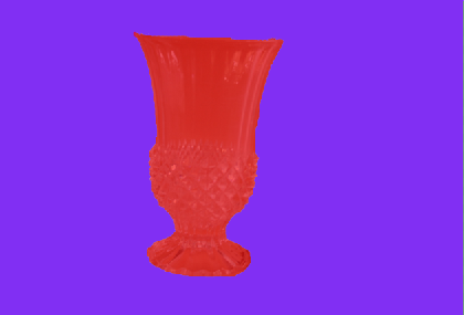
glass vases


doming tool


bird frame


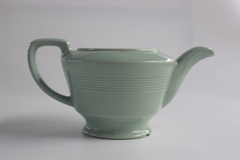
tea cups


tea cups: lined up


cutlury


plant pot


garden tools


pink shoot


purse and pin


makeup


red shoot


Work done on photoshop


before
|
After
|


green shoot


work done on photoshop


|

|


out come


evaluation
My main theme was different objects and I explored the different types such as corled objects, old fashioned objects and makeup. I thought the theme was good because I was able to take images of objects that I liked and that I enjoyed.
I did like the theme, I can see that I was able to photograph different objects. It also allowed me to be creative in different ways and I improved my knowledge and I learnt different skills.
I did like the theme, I can see that I was able to photograph different objects. It also allowed me to be creative in different ways and I improved my knowledge and I learnt different skills.
In photography I found the use of Photoshop the most interesting because I enjoyed manipulating my work and improving the images I had taken. In my opinion I preferred taking photos because I enjoyed it a lot more and I found it more useful and easier.
I enjoyed setting up location shoots, I did this in the classroom using the natural light and the wooden tables. I enjoyed going Padley Gorge and taking action texture images. I also enjoyed learning how to use the camera on manual settings.
I enjoyed setting up location shoots, I did this in the classroom using the natural light and the wooden tables. I enjoyed going Padley Gorge and taking action texture images. I also enjoyed learning how to use the camera on manual settings.
Building a website using Weebly was a new skill that I did not know before and it is a skill I can leave school with and it will be useful I have learnt how to Photoshop also how to copy and paste layers and use the blur tool I found it hard at the start but as the more I used it got easier. The camera techniques I used was WB ISO Manual settings, In my opinion learning how to use the camera was very difficult at the start but it got easier over time.
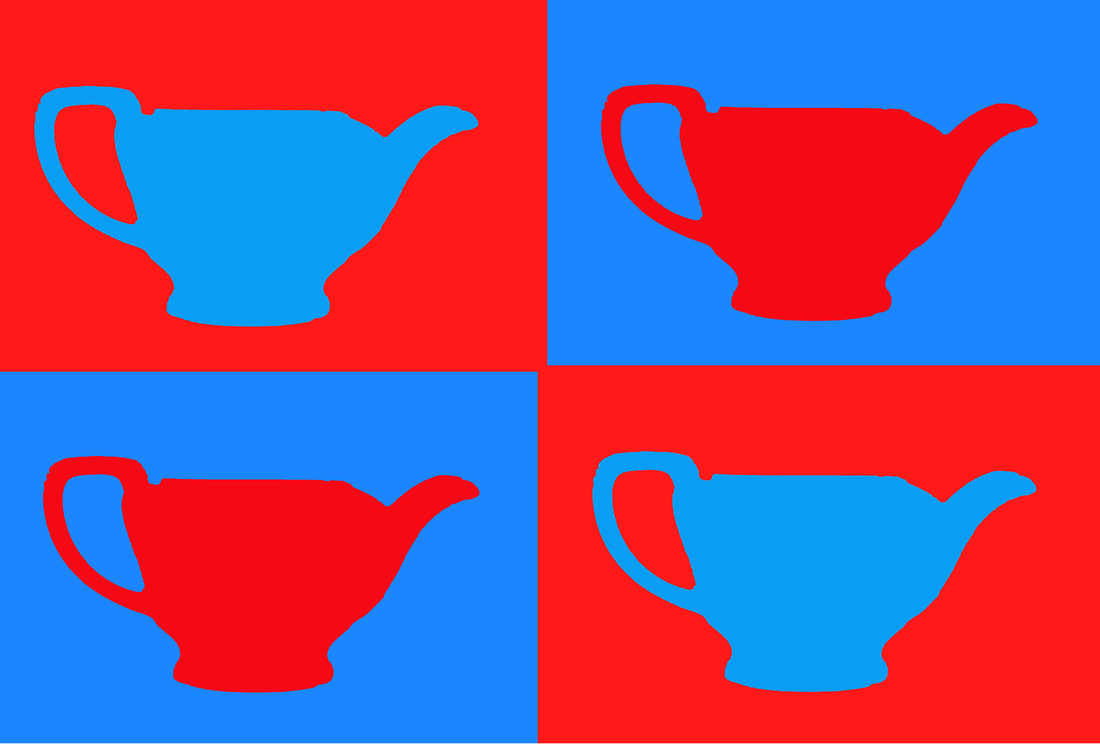
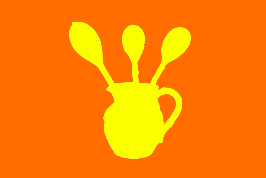
I have developed my skills more in Photoshop by using the selection tool, created new layers, picked different backgrounds, selected new filter layers and explored different colours, to create a Pop Art effect. I was really happy with the outcomes as I personally really like colour and I feel this made my project more personal. I also learnt how to use Canva to create posters and improve my final outcomes.
To link my work to the research I did, I started off my taking photos of objects that linked to the research I did on Catrambone, Weston and an image I found on the internet. I took photos of single objects, like Weston, and tried going close-in with my camera, similar to him. I also took photos of objects looking down, just like Catrambone. Right from the start I was interested in using colour and so I took photos of just one colour objects that linked to my research. My final ideas to use block colour I think took my work on a journey.
I really enjoyed taking photos, using the camera on manual, so that I can control the images. I think I am good at setting the objects out and looking at the composition to get the image I need that links to my research. I also used my phone camera a little bit which has a good lens and allowed me to be a bit more creative.
I learnt how to use different websites, such as weebly, Canva and Pop Art tutorials to help me create a professional looking portfolio of work, which I am proud of. I feel that I have expanded my knowledge using IT and feel more confident using it. It has also helped me to take my work on a journey as I not only took photos but I then came up with the idea of presenting the objects in a graphic way, which I think makes my work more professional.
If I were to do this project again I could maybe choose different objects to photograph that linked to my life a bit more, such as my own makeup, clothes, shoes and bags. However, I feel this would have been quite similar to my previous project and so chose to use other objects.
Overall, I am happy how my exam project went as it made me more independent which is a big step for me.
Overall, I am happy how my exam project went as it made me more independent which is a big step for me.
21st april first exam i will not add any more infomation or make any changes to the work abuve


work on photoshop


WORK ON PHOTOSHOP


WORK ON PHOTOSHOP


WORK ON PHOTOSHOP


WORK ON PHOTOSHOP


WORK ON PHOTOSHOP


WORK ON PHOTOSHOP


WORK ON PHOTOSHOP


FINAL DESIGN

WORK ON PHOTOSHOP


final design

final gallery


|

|
|


I have continued making images on photoshop and decided to design a poster with the theme pop art I think my images worked well together and the colours I used worked well together.
