the choice of colour
sTATEMENT OF INTENT
I aim to create a selection of work based around my theme which is colour. I would like to take photographs of makeup, beauty products , accessories such as bags. I want to focus on the seasons. For example I will use pine cones for autumn with beauty products. I will also take images of flowers so I can use them as a background or logo for my final images. I aim to create a final product such as an advertisement poster or a magazine cover. To me these end products need to use colour in order for them to attract attention. Each magazine cover will be different because of the seasons. For example I will change the different aesthetics, for the winter season I will use shades of blues, for the summer one I will use pinks and for the autumn one I will use oranges and browns.
For my research I will begin by making a coggle to show my initial ideas and my plan and create mood boards as this is how I begin my thinking process on how I will produce my personal response to the theme colour. This will be my starting point as this will help me gain ideas and inspiration to help me plan my photoshoots and props that I will need. The photographers I will look at may be people who take photographs for campaigns. It may just be magazine covers and make up adverts. I want to focus on the photographer Jacob Reischel because of the products he uses for example, he uses makeup and perfume which is what I would like to create in my own work. He also uses bright colours and he organises his colours by using different shades of one colour. Another reason I would like to focus on his work is the way he places his objects is professional, which is the way I want my photography to look. Overall this photographer will inspire my work because of his use of composition.
I chose the theme 'colour' as I wanted to create something bright, bold and vibrant. To me, colour represents me as a person as it shows my personality and how I am feeling. I am a person who loves colour and would say I wear at least one bright colour a day. Even if it is a bright lipstick I have to have colour otherwise I feel that my outfit looks dull. I then focused on seasons and had different colours for different seasons. I will use different textures with my theme by using pine cones, flowers, perfume, makeup and bags.
I will use different coloured backdrops to go with my product, for example bright pink , orange and maybe yellow as this will allow my products to stand out. I will also try plain white as this will allow me to add the flowers to the background on Photoshop. Once I have got my images I will work around the same picture on photoshop and create different outcomes. I would like to add texts to my images and different logos for magazine covers. I will independently work around the school and take photographs and I will also bring my own objects into school to take pictures of.
The equipment I will need is a camera, a tripod, different colored backdrops, a camera and different objects to photograph. I want to experiment with different lenses because it shows you are creative. When taking pictures independently I will use my phone as I don't have a camera at home. When I get to use photoshop I will add text to my pictures, cut out objects and place them differently, I will also use a variety of colour techniques such as black and white brighter pictures.
In the time I have to complete my work I want to give myself 4 weeks to get my research done, to complete photoshop outcomes of photoshop, take pictures and also create best and worst photos. Then I will give myself 2 weeks to do all my editing, adding texts on my pictures and trying different colour techniques. I will select my best photography outcomes and turn it into an advert or magazine cover. My final portfolio of work will either be advertisement posters or a selection of seasonal magazine covers. I am going to show how I get to my final stage by selecting my best and worst from my photoshoots, as this will allow me to make improvements when taking my next set of photographs. I will snip my photoshop process as this will visually show and document my beginning, middle and final outcome. I will take my peers' strengths and weaknesses to help me get the best outcome I can achieve
coggle- mind maps


mood board


research-Jacob Reischel

4c's
context
Berlin-based design duo Marie Jacob and Julia Sutratman (Reischel), are the two talented ladies behind . The two, who both studied industrial design at The University of Arts Berlin, have varied specialities – Marie started her career as a photographer and Julia as a graphic designer – but come together to create works of perfect aesthetic harmony. The interdisciplinary nature of their works means the projects they undertake are varied in range, but still inherit the Jacob | Reischel signature of balance through color and object selections. Their work includes design projects for magazines and webpages but they focus largely on creating concepts and making still lives. Jacob | Reischel produce sleek and vibrant images for a versatile and cool client base that reflects the modern and fresh aesthetic of their works.
composition
In this photograph, you can see foreground and middle ground. In my opinion I like the style and I like the techniques the photographer has used in this photo. He has used rule of the thirds because in the middle of the photo he has put perfume to make it stand out to the rest of the photo. He has made it look professional by covering the background with a colored sheet. Another reason I like this photo is because he has mixed it with food and a object, which makes the picture stand out more. You can not tell what the time of day it is but I predict that it is morning and also I think it is inside where he has took the photo. The lighting looks soft and also he has made it light in some ways but dark in others to reform shadows of the objects. He has the camera on a eye level. He has cropped it to make it seem as though your in it. Also he has matched the color of the background to the colors of the objects in the picture. He has put the red tissue paper under the fish to make the color red pop with the brown background which makes it look extremely professional.
connection
I personally think that it links to my work a lot because I am doing my work bright with splashes of different colors that clash together and I think when you do that it gives a unique look to the picture and a professional link. I also think that it links to my work because Its used the techniques I would want to use and it looks like you have put time and effort into capturing this picture. Another link this picture has to my photos and my outcomes is the camera angels.
comment
In my opinion I like viewing this image and I like the set up of this photo because the colors are dark and also I like the pop of color. In my opinion this photo is the type of photos I want to create in my project. I also like the soft and smooth effect that the photographer has created. It links to my work I would like to create. I love this technique because it is the style I want to create my photographs like. I enjoy researching these kind of photographs because it shows my understanding of what I want to achieve by the end of this unit.
research - petra collins shooting gucci flora

context
Petra Collins is a Canadian artist, director of photography, fashion model and actress who rose to prominence in the early 2010s. Her photography is characterized by a feminine, dreamlike feel, informed in part by a female gaze approach.Collins began taking pictures in high school. She met Richard Kern while assisting him on a shoot, and he became her mentor. Simultaneously, Collins became a frequent subject of the photographer Ryan McGinley, and would go on to become one of his proteges.
composition
In this photograph, Petra Collins is using foreground, middle ground and back ground. In the foreground there is moss and flowers and also the perfume. In the midground there is more flowers but in the background it is very soft and light. This is effective because it draws attention to the object in the middle by having the foreground and background out of focus. I think that she has made some flowers light pink and she has made the bottle pink to match the two shades of pink together. She has made the flowers the same colour pallet as the flowers on the bottle to create a natural aesthetic for the photograph. In my opinion she has created the flowers to appear bigger than the bottle when in reality the bottle would be bigger I think she has done this to make it look more professional. There is a border around the bottle where there is no flowers because it focuses on the perfume bottle. The photograph looks new as it seems that it the camera quality is advanced. I think that this is a landscape image and she has used a wide angle lens she has done this to show all of the flowers in the background and create impact. The bright white lighting gives the effect that it is foggy and reflects the light on the bottle. I can see leading lines in the moss that draws your eye to the bottle and they have also used the rule of thirds, the foreground is in the bottom third and the two other thirds are flowers. This makes the bottle stand out as well as the camera angle is looking slightly up at the bottle. In my opinion I think this is a studio shot and has been lit carefully so the bottle stands out.
connection
This relates to my work because in my work I have focused on flowers and perfume bottles mostly. In my work I have used all one color pallet and in her work she has used all one color pallet, I think that she uses different shades of pinks and as I've done the same our work links together a lot. The use of contrasting in focus is something I've used in my own work by putting the foreground and background out of focus, we both use this to focus on the bottle.
My photo shoot plan
what equipment will you use?


•DSLR CAMERA
•tripod
•studio lights
•different colour back grounds
•reflector
•tripod
•studio lights
•different colour back grounds
•reflector
what props aRE YOU GOING TO USE?
iN MY PROJECT I AM GOING TO GET 2 OR 3 MODELS, AND I WILL TAKE PICTURES OF THEM. THE PROPS I WILL BRING INTO SCHOOL FOR MY MODELS WILL BE: CLOTHES (BRIGHT), SHOES, MAKEUP AND JEWELLERY
HOW MANY PHOTOS ARE YOU PLANNING ON TAKING IN THE SHOOT?
I AM PLANNING ON TAKING AT LEAST OVER 50 SO THEN I CAN HAVE OPTIONS TO CHOOSE OUT THE PICTURES
WHY ARE YOU TAKING THESE PHOTOS?
I would like to take these photos because I have a passion in clothes, bags, shoes and jewelry. I also would like to take photos so I can make magazine covers (vogue).
how does it link to your research, mind maps, and mood boards?
It links to my work because in my mind maps and my mood boards I have put the pictures and writing that I want to take and what I want to write about. I have done this because then it is not random pictures and I think it makes it look more professional
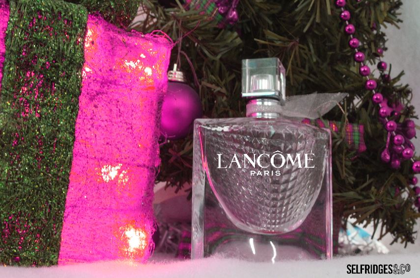
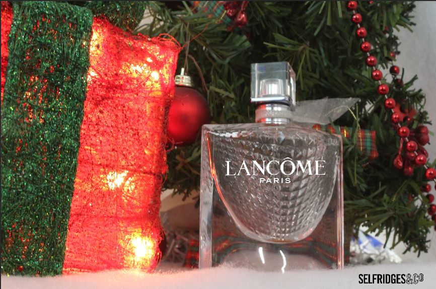
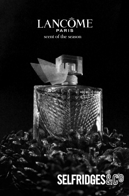
MAKEUP SHOOT
shoot 1


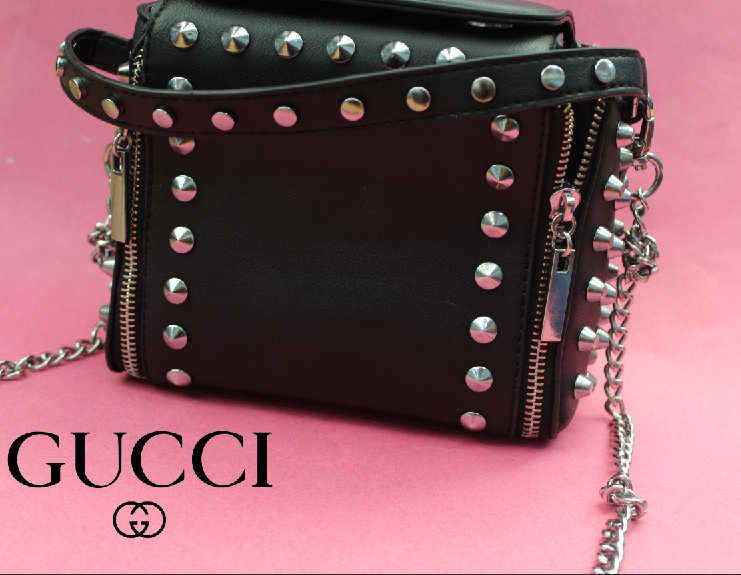
BAG SHOOT
shoot 2


best |
worst |
|
I think this is my best picture because it looks professional and I like how I have angled the camera.
|
I think this is my worst photo because you can see the background and it makes it look unprofessional.
|
EDIT 1


EDIT 2
Photoshop- I am using photoshop because I want to be able to make my own brand of makeup and my own brand of a designer bag on a magazine as my end product so I am starting to progress my ideas. By starting with logo designs that are already available to help me with composition and placing the text of a logo.


outcome


final outcome
pink bag
shoot 3


shoot 4
black bag


product shoot
shoot 5


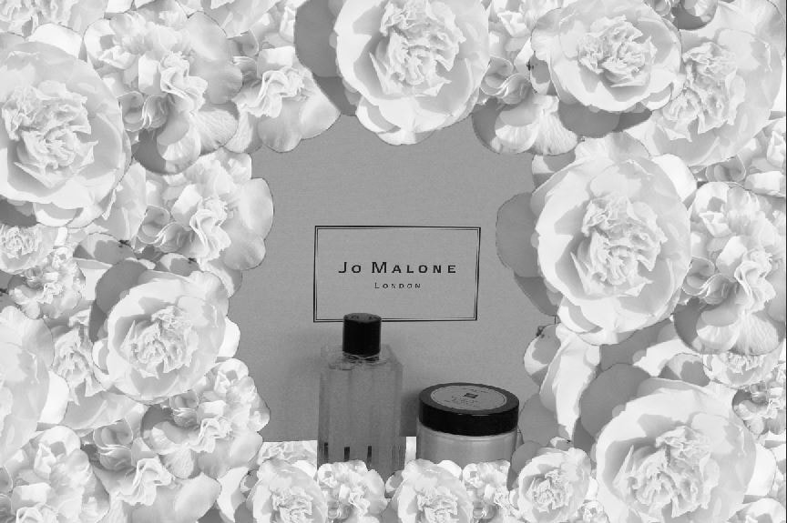
This setup did not work well because the fabric I used was too transparent and was letting too much light in and background that I dint want to capture.
I decided to use paper background using the same color as I liked the contrast between the bag and the blue background.
I decided to use paper background using the same color as I liked the contrast between the bag and the blue background.
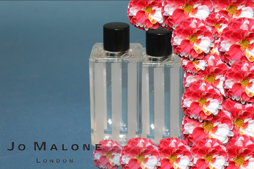
new shoot using paPER BACKGROUND


bEST
This is my best because when I was taking this picture I checked everything: the aperture, the exposure and I made sure that the camera was on a good angle. The photograph has a smooth texture to it. I feel as though the caption is visually eye-catching. Which made this picture my best.
|
WORST
In my opinion I think this is my worst because the exposure is way to bright. The camera angle is effecting the picture. Also I think the composition is wrong when I was taking it I could of been took it differently. And it isn't focused This is why this photograph is my worst.
|


mOOD BOARD


Edits on Photoshop


|
|


Edits on Photoshop


Final image
I have made this on Photoshop to gain ideas on where to place my flowers and text , but I do not like the final outcome because it is to organised and the layout looks boring. I have kept this piece of work to show my refinement.


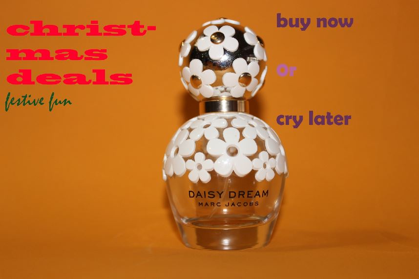
autumn shoot


edits on Photoshop


outcomes

|

|
spring shoot


best |
worst |


final outcome
winter shoot


EDITS ON PHOTOSHOP


|
|
final gallery
summer

spring

autumn

|
|
winter

mAKEUP AND BAG


Self Reflection - 'How do you know that you have been successful in your learning?'
Paragraph 1: what was the project and what did you think about it?
The main theme was the choice of color and the way I decided to make my website look was to do different weathers. I explored the different types such as winter, spring, autumn and summer and for each theme, I did a shoot and made it connect with the weather. I thought the theme was good because I was able to take images of objects that I liked and I enjoyed taking these photos because it makes me explore a lot more. In my opinion it improved my knowledge and skills a lot also it made me be more creative with my ideas.
paragraph 2: what part of the project did you enjoy the most or found most interseting?
In photography I found the use of photoshop the most interesting because I enjoyed manipulating my work and improving the images I had taken. in my opinion I preferred working on photoshop editing my photographs because it was more fun and I enjoyed it more. I also enjoyed setting up location shoots because it made my ideas more creative.
In my opinion one of my weaknesses was using the camera and how to work it on different settings such as manual settings.
In my opinion one of my weaknesses was using the camera and how to work it on different settings such as manual settings.
paragraph 3: what new techniques have you experianced?
Building a website using Weebly was a new skill that I did not know before. I have learnt how to photoshop with my images some examples are; how to use different tools and also use the copy and paste tool. I used different tutorials to show me how to use some of the tools I did not know how to work and it helped me a lot using tutorials of YouTube.
pragraph 4: what technique woud you like to develop further?
I would like to develop my skills more in photoshop such as blur tool and selection tool. For my next project I would like to learn about lightning because I feel as thigh it would make my images look more professional.
paragraph 5: which photographer did you research through this project?
|
I used these photographers because there photographs inspired me and made me want to be more creative with my work and also in my opinion these photographs are professional and I wanted my work to be like this.
|
PETRA COLLINS jacob reishel |

paragraph 6: how have they influenced your photograph?
In my opinion they have influenced my photo's because there photos gave me inspiration and it gave me more ideas and i like the way these images are set up and I think that this theme goes with my project a lot.
paragraph 7: which technique did you enjoy the most?
I really enjoyed my photoshop, using the camera and all the different settings also going out on location. The best tool I used was the text tool because in my opinion it gave me good outcomes, I grew confidence in using Photoshop and this helped give me motivation to continue and improve.
